Filing taxes through Rise was confusing, which led to mistakes, fines and instructions left in a comments box for the finance team.
My role
Product designer and researcher. I mapped the current and new workflows, ran a competitive analysis and designed the new flow.
The team
An engineering manager, 2 engineers and a product manager, with support from Rise's internal finance team
The outcome
A 62% completion rate, 10% higher than the previous non-COVID year, and no more instructions left for the finance team to handle.
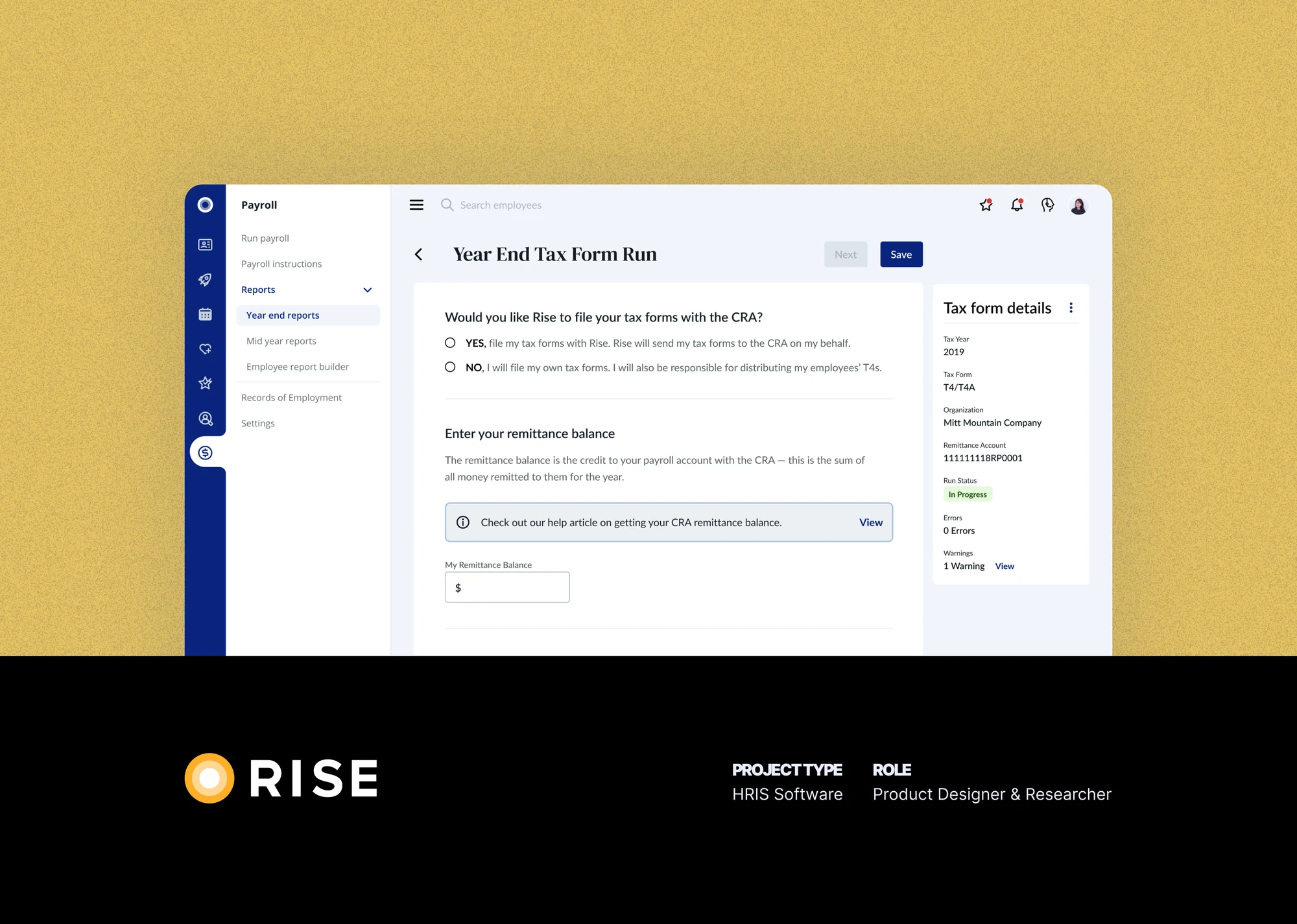
Tax form delivery is a feature that allows users to file their organization's taxes to Canada Revenue Agency (CRA) as well as distribute tax form slips (T4s) to their employees.
The project started out by considering only small and medium UI fixes and general improvements to the user experience, in order to increase the completion rate of tax submissions.
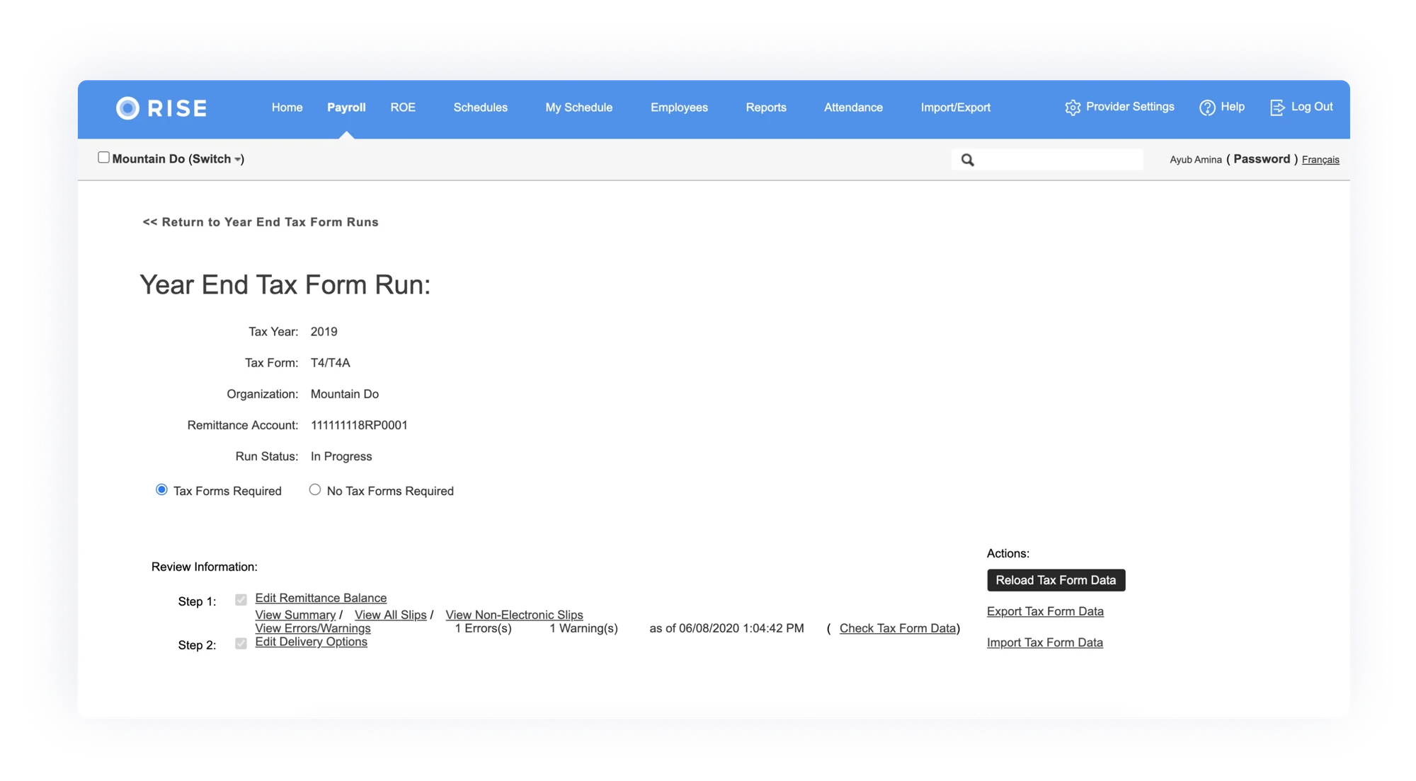
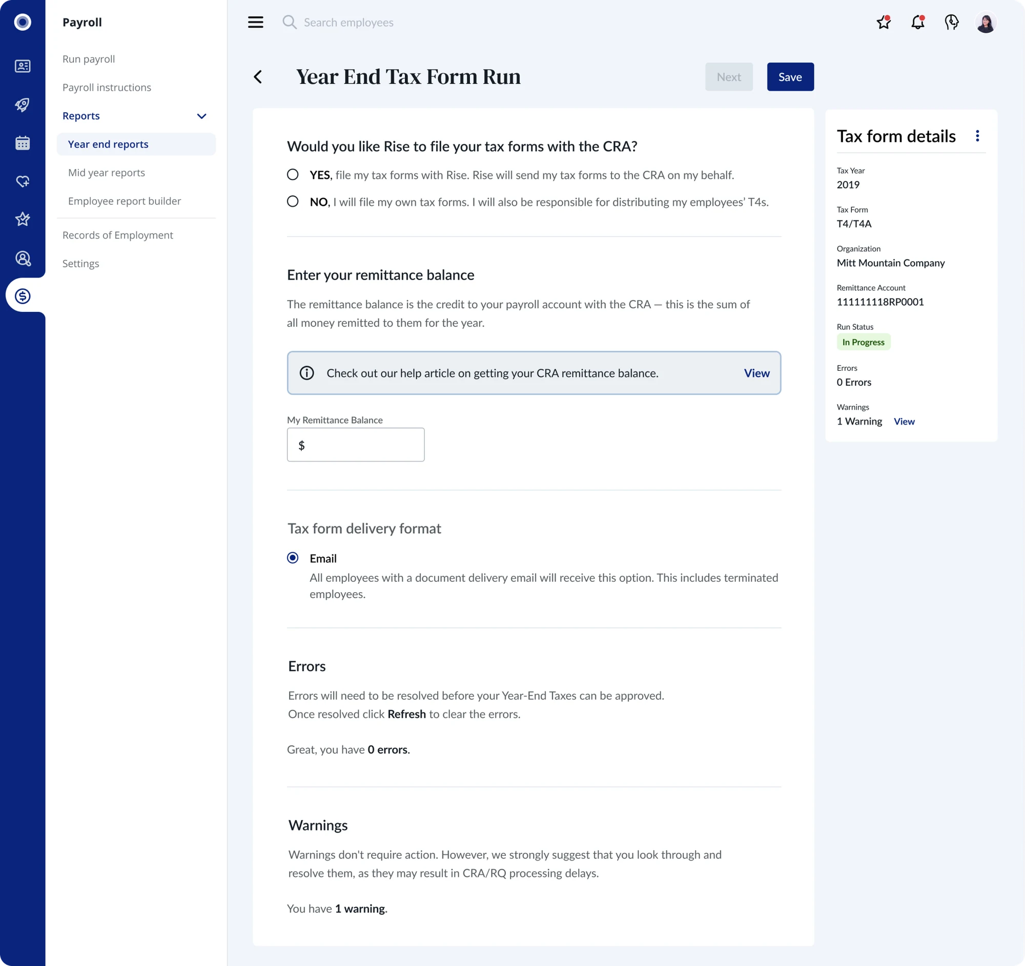
Previous version of Tax Form Delivery
I had the opportunity to learn about this tool's legacy, which gave me a richer context and an understanding of why decisions were made in the past. Speaking regularly with Rise's internal finance team leads made it clear that small to medium fixes would not provide meaningful long-term improvements for either the internal finance team or Rise's clients. I did some deep investigating that revealed several main issues that small to medium fixes wouldn't address:
Unclear copy, page layout issues and unorthodox interactions resulted in a confusing process
Mistakes that weren't caused by user error, creating misunderstandings and financial consequences*
The comments component being used to leave instructions**
*Usually by not fully knowing if their taxes had been submitted to the CRA.
**253 or roughly 7% of tax submissions in 2020 had instructions and/or comments ranging from, "I hope I did this correctly." to "email employee T4s only." and everything in between.
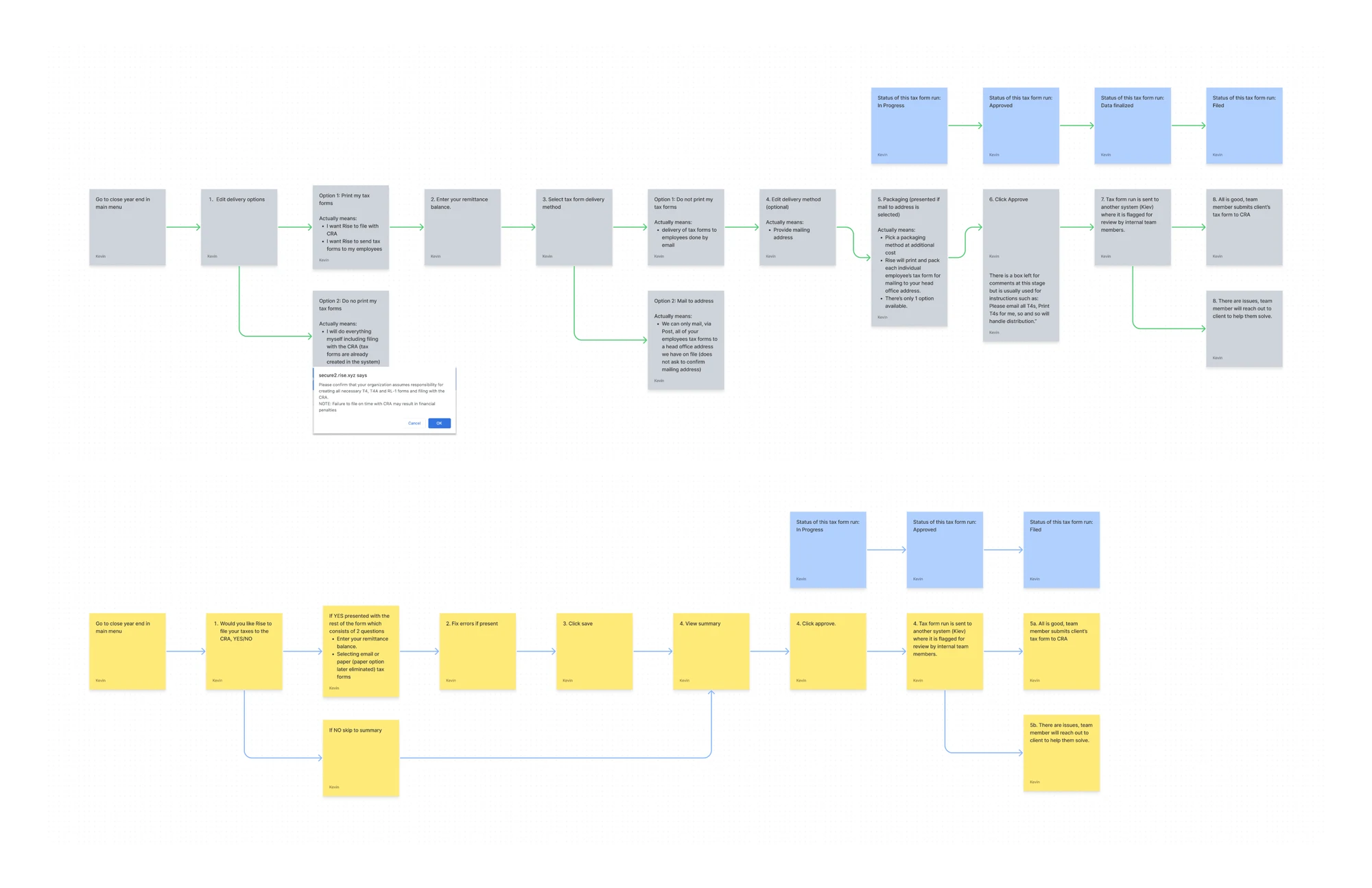
It took several passes and countless conversations to clarify the tax process and how it relates to the various systems that need to work in unison to successfully submit an organization's taxes. I mapped out both the current process (in grey) which affirmed many of the issues mentioned above and a newer workflow (in yellow).
The new process did not differ that much from what was supposed to be accomplished at each stage, but it did make the experience much more straightforward.
Mapping out current (grey) and newer (yellow) workflows
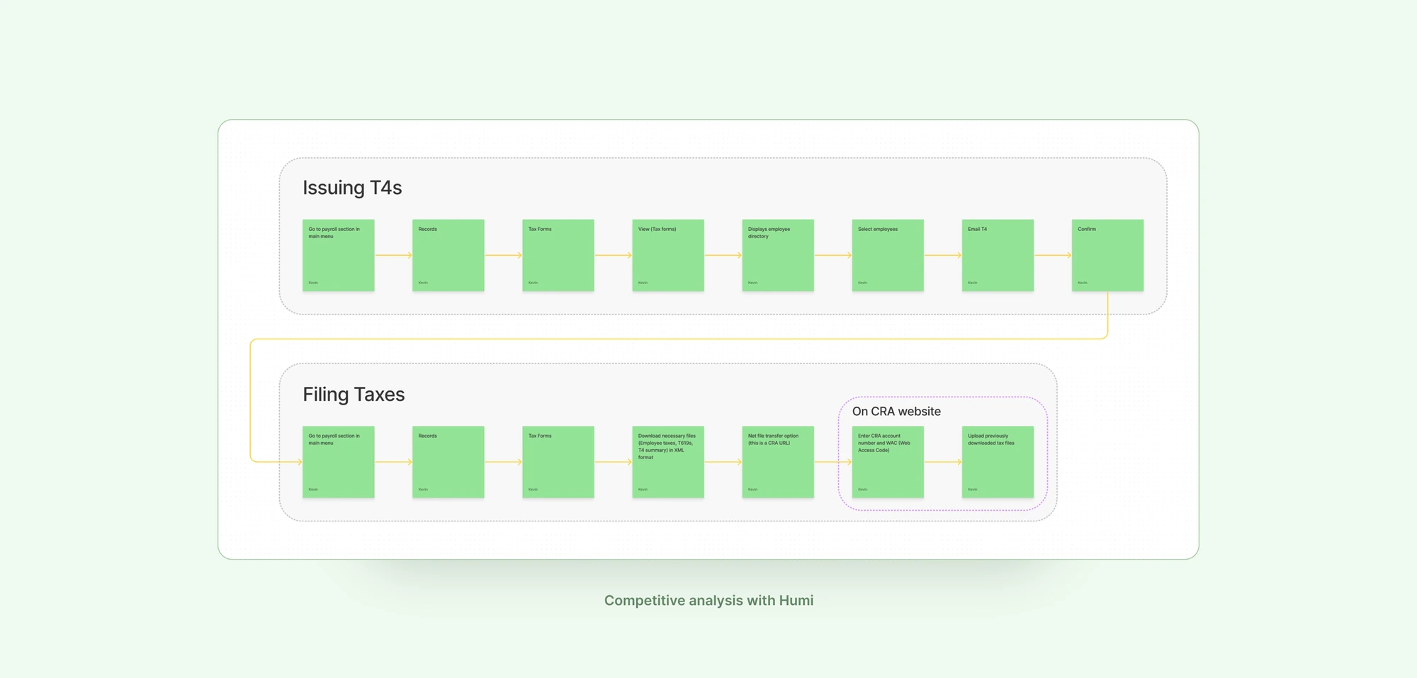
I performed a competitive analysis on one of Rise's closest competitors and discovered that they actually require you to finish the process outside of their platform, on the CRA website. Rise offered a one-stop experience with no redirection, and I wanted to leverage that strength.
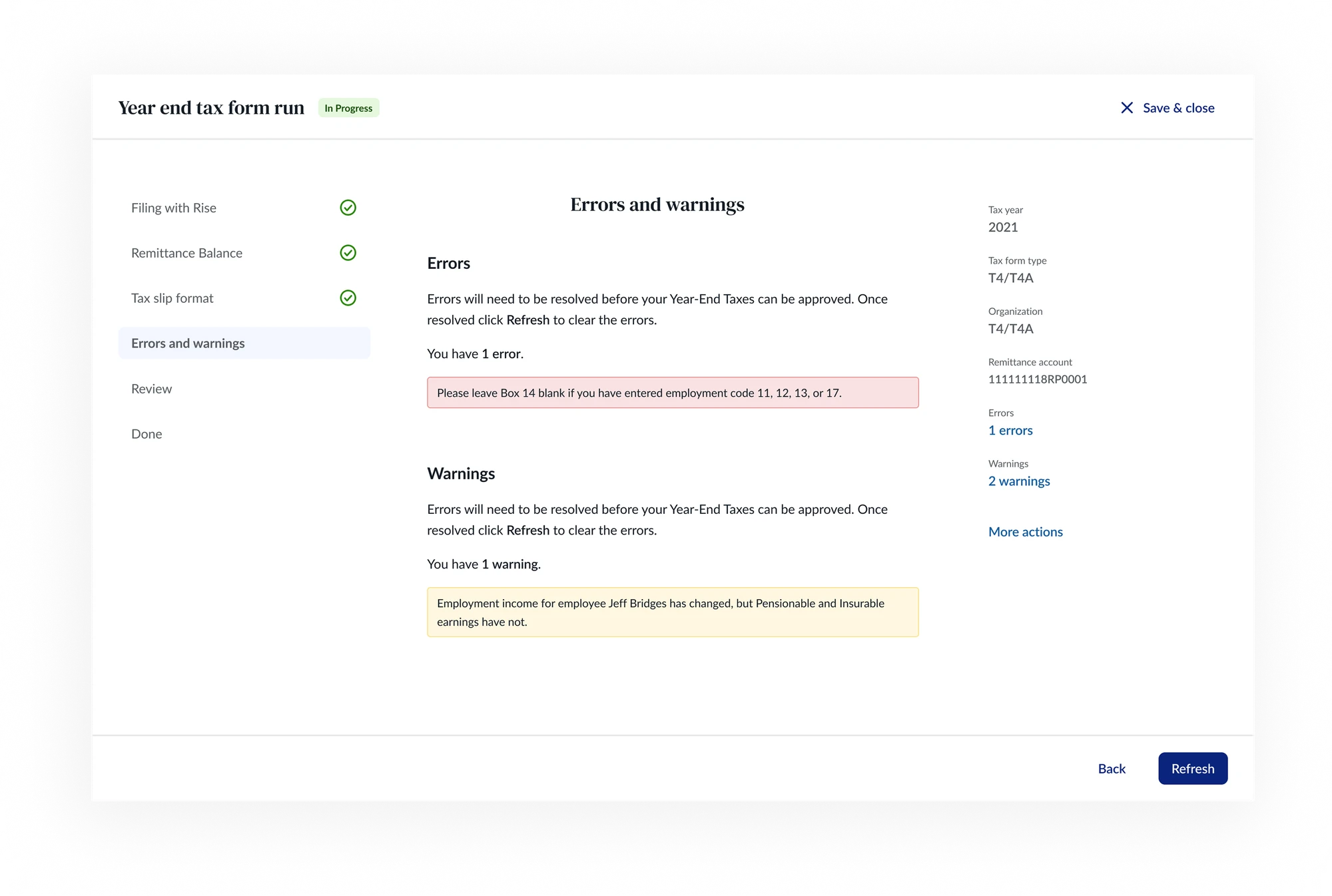
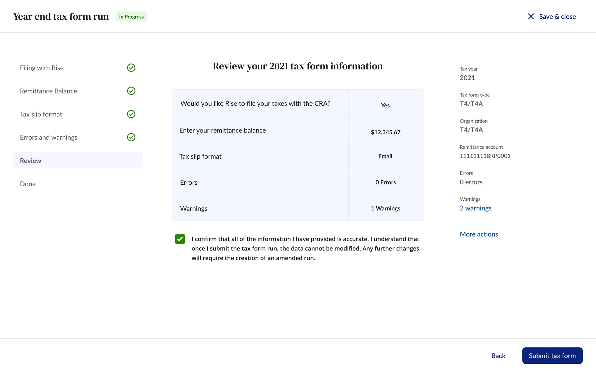
I wanted to push the design and craft further and bring some Rise magic to the legacy UI. My first iteration used a new step-by-step wizard that the design team had worked on, which already existed elsewhere in Rise's product suite.
I worked with the engineers to figure out what was technically feasible and within the scope of the resources available. The main issue was that making the jump to more modern technologies would take too long. On top of that, the new layout would need more front-end styling work than the team usually did, which would take extra time to ramp up on.
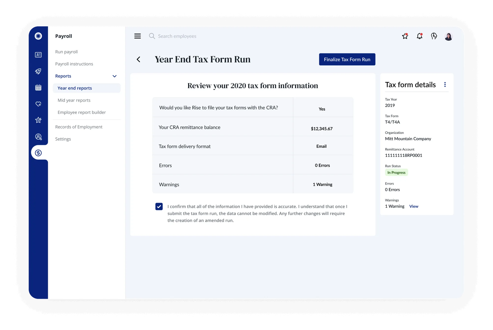
The end result had the same thinking and concept but a different interface. I had to reconfigure the wizard onto a single page which would still emphasize the step-by-step process.
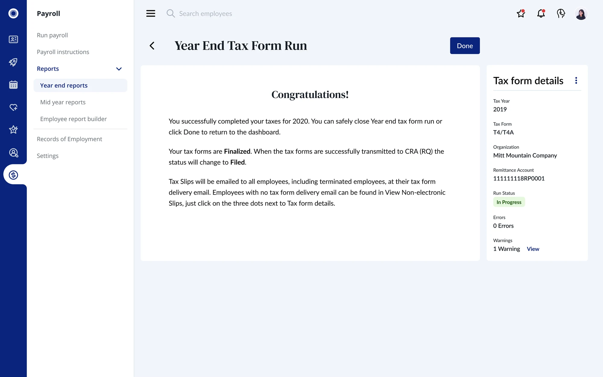
Through feedback from my fellow design team members and peers, a summary page and a congratulations page were added to enhance the experience. The summary page made it clear what users were submitting and what the next step was, with clear copy on the button: "Finalize Tax Form Run".
Capping it off, the congratulations page served two purposes. First, it made it clear that the filing process, and their part in it, was complete. Second, it gave us a place to explain what would happen next, a moment where users often got confused in the previous experience.
💫
Some of the measurable ways that the new design helped customers:
No complaints from clients about misclicks, "What does this do?", "I accidentally selected..."
62% completion rate, which is 10% higher than the same time in the previous (non-COVID) year
No "instructions" left for finance team to handle
📈
A few improvements for future consideration would be: